Processing "Posted: No Trespassing"
Deciding What, Why & How
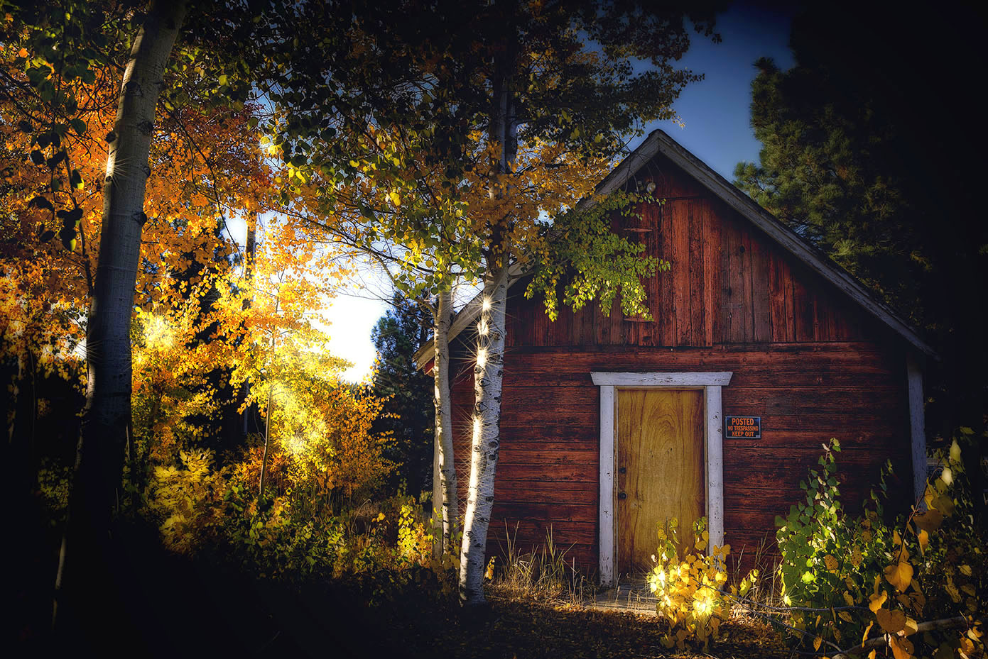
I like “old building, new growth” juxtapositions. I especially love it when the old building says “Posted, No Trespassing”. It’s just so quaint and presumptuous. Oh, I know it’s a modern sign meant for modern, rude humans… but as a captured moment, the combination makes me giggle.
In this photo, I also loved the side light. It was the blend of “old building, new growth” and “cool side light” that made me want to play with this photo.
Since I often get asked to show my original photo(s) along with the finished one… here’s how this one came together.
First, here’s the finished version:
And here are
HDR, K-Hutt Style
the two I started with

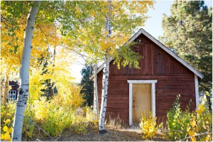
I blended them into an HDR (High Dynamic Range) image, which I did so I could get the gradations of color and light where I wanted them. I used Photomatix. That link has a cool little tutorial about how to use Photomatix, right on the developer’s website.
That put us here, which isn’t bad at all:

But like I said, I wanted to see what happened if I made that side light more of a feature… which in turn would make the photo and its story more dramatic.
Adding Drama & Mystery
So I added NIK Software’s Midnight filter, found in ColorEfexPro 4 to bring in the dark. It adds some softness and mood to the mix, then in Photoshop used the Gradient Tool set on Reflected Gradient to pop out some of the the dark on a diagonal. I’d later brush out a bit more, but wanted to make the space for that to happen:

I thought that made the upper right corner area a bit too dark, so lightened up the sky and tree area some:

At this point, I was mostly looking at the outer areas of the photo… hadn’t even begun to touch the center, other than using the Gradient Tool. I wanted to make sure that the dark was all set, since whatever I did to the middle section was going to be held in mystery by the outer. I liked my framing now… time to tackle the center.
Bring on The Light
In one pass, I used NIK Software’s ColorEfex Pro; Pro Contrast for some lift, the Skylight filter to bring the warm colors back in, then over to onOne Software for just a touch of its Center Spot Focus, found in the Perfect Effects Suite. Just a touch, mind you… it lent a bit of brightening and warmth to the center and helped soften and darken the outer portion. I contained both of those to the more colored/lit center area by using a combination of the selection tools within ColorEfex Pro – and a layer mask back in Photoshop. Use of those tools allowed me to keep my outer dark tones. Those three steps landed us here:

Now it was mostly fine tuning. I used NIK Software’s Viveza to add some definition and further brightness/warmth to the leaves on the left side of the photo. This is the area closest to- and most affected by – the light source (the sun). Naturally, that would make this section the brightest. When you’re playing around with light, you have to keep in mind where your light source is – and how it naturally affects all the parts you’re altering. That means light, shadow, reflection, brilliance, etc. So even if you decide to bend reality somewhat (like I’d ever do that. Wink.)… you obey the basic laws of the nature. Otherwise, nobody will believe your vision and that’s just plain depressing.
Sparkling Things Up
Next, I had to try something. Topaz Labs recently came out with a new plugin: Star Effects. I often use Red Giant Software’s Knoll Light Factory when I want to add some cool lighting effect. I seldom see other software companies offering anything along those lines… so was curious to see what Topaz had come up with. They had a super special deal going when I looked, so I snagged Star Effects and gave it a spin.
I ended up liking what it did here… at least as alternative to my original vision. It bends reality a bit… but doesn’t break it. It also made me smile, so I decided to leave it. You can see the effect on the center aspen… and it also plays in the trees to the left, in a more subtle way:

Final Touches
As a final step, I wanted to brighten up the house – so the sign and the cool textures in the wood were better revealed.
I didn’t want this photo to actually be bright… I wanted it to be moody in sections, sparkly and warm in others, softly looking out from the shadows in others. A moment where not everything is obvious all at once.
I liked where it ended up.
Some light, some shadow, a mood, some old-meets-new, a bit of time-changes-everything, and wee touch of reality bending.
A good day, in my book!