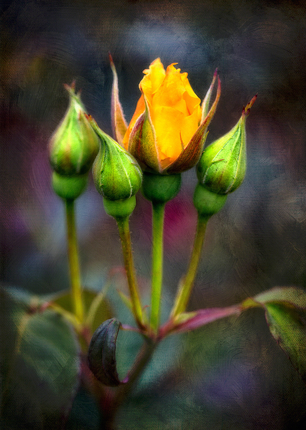
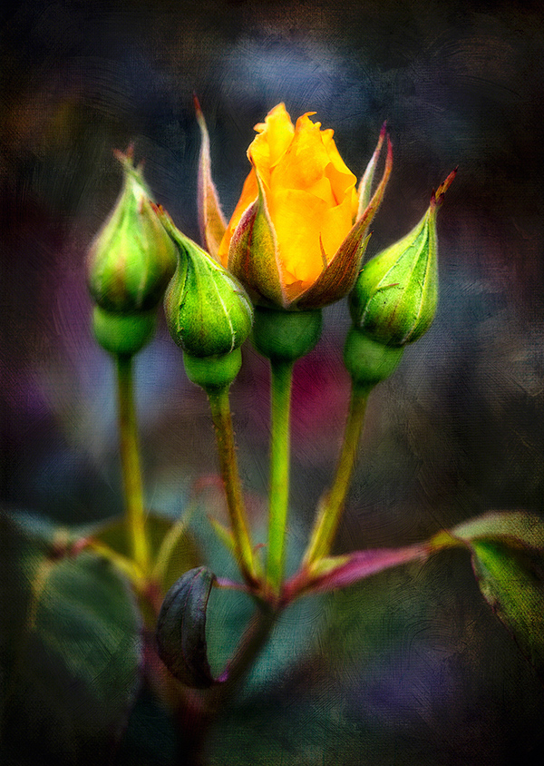
Stop and Smell (also Texturize) the Flowers!
It’s end of summer and also the end of my unplanned bloggity-blog hiatus. You may not have even noticed; I know how busy you are. 😉 But I’m back now, with much I’m about to announce! Stay tuned for that. But first: I thought I’d ease back into the swing by sharing one of my recent artsichord (like that word? I made it up. heh.) experiments. A triplet of roses, plus a neighbor; with one showing everybody else how it’s done.
My about-to-be-announced project started like they all do: me thinking “Oh, that’ll be a piece of cake!”… and ending up on a steeper learning curve, with more delays and challenges than I ever dreamed possible! But there’s universal intelligence at work for ya. If you knew how hard something was going to be going in, you’d probably not even start! Along the way, I had less time to process photos, less time for everything except total immersion.
Somewhere along the way though, I finally had to just stop, smell the roses and process some photos! Not surprisingly, my creative desires are emerging from my “voyage d’immersion” with cravings for some different flavors. Here, I ended up playing with textures, light and contrasts in an entertainingly (to me, anyway) new way. Figured I’d share the steps. This is ONE of the finished pieces, followed by each step along the way. There are about 10 of them. You might want to get a little coffee, glass of wine, a nosh. Here goes:
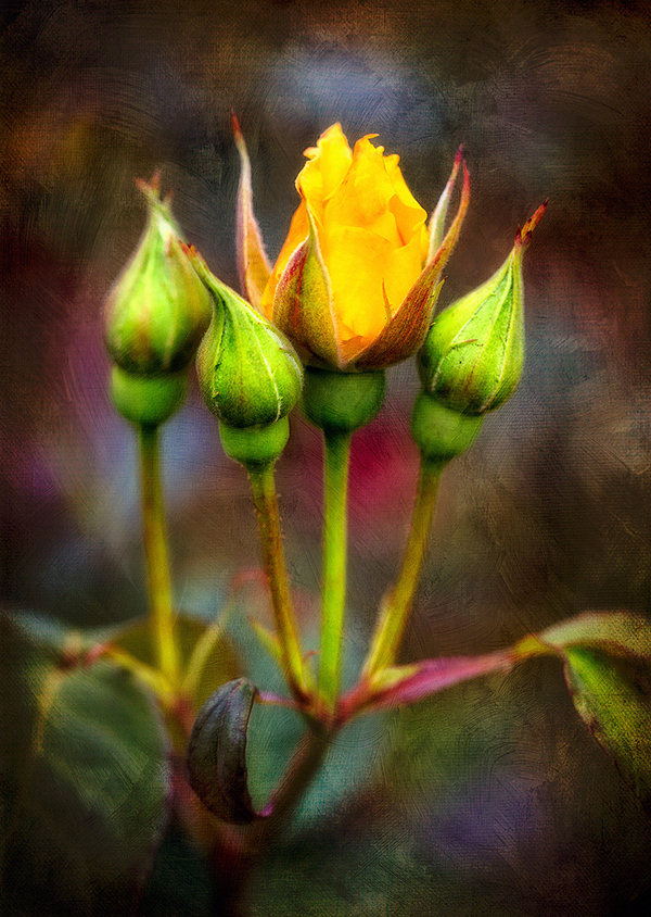
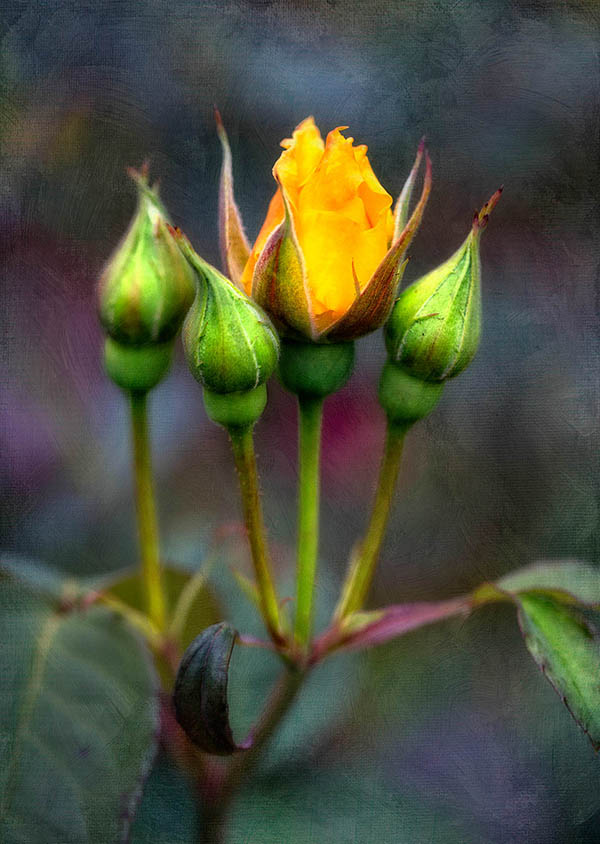
Here’s where we started: the original, single frame shot from my Canon 5DIII, Macro 100mm, f/2.8 II lens.
It’s pretty, I like it – it’s not a vibrant as it was to my eye, but that’s a RAW photo for ya. All the data awaits in the file, just waiting for you to reveal its splendor. Or something like that.
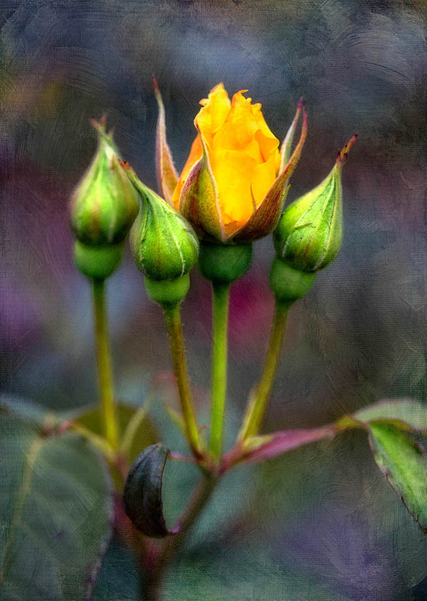
Anyway, first stop was OnOne Software’s Perfect Effect 4.0. I used the Basic Brushes/More Punch tool to brush in some, well, punch into the flowers and stems. I knew I wanted them to stand out… after all, they’re triplets!
I never like doing everything at once… because if want to change a single element later, it’s MUCH easier to do it on just the layer that has that element. Besides, I can’t see it all at once. I have to bring it all back into Photoshop (CS6 in this case), make it smaller, larger, walk away, come back to keep my eyes fresh. That’s my process anyway. Works for me!
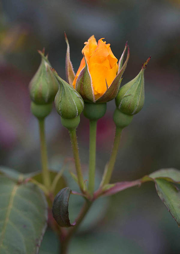
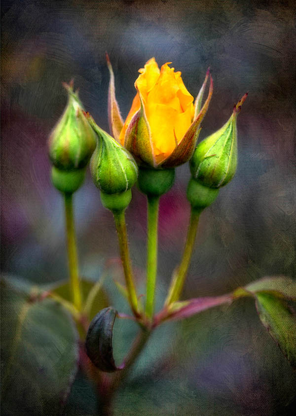
I knew at the beginning I’d want some glow in this photo. But the trick with ANY glow is to not go crazy. I like to bring them in by degrees – even use different kinds in stages, sharpening sections after, building gradually. In this case, I again used OnOne’s Perfect Effects 4.0, but this time went for the Glow/Rich Glow effect. NOT GLOBALLY! Goodness no. Bite your finger! Instead, within the app, I let it affect the background more by brushing some of it out of the flowers. There’s a nice brush tool in the app that lets you do that. Back in Photoshop, I brushed back some of the detail in the layer beneath… the one with more Punch. I didn’t want that golden flower to get too mushy and lose its gentle details.
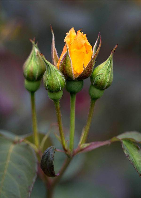
Another thing I wanted these flowers to do was POP. You’ll see what I mean next… because I used OnOne’s Center Spot Focus, found in Perfect Effects 4, at about 60% opacity to give those triplets and their neighbor some zing. I liked what it did to the colors directly behind them too:
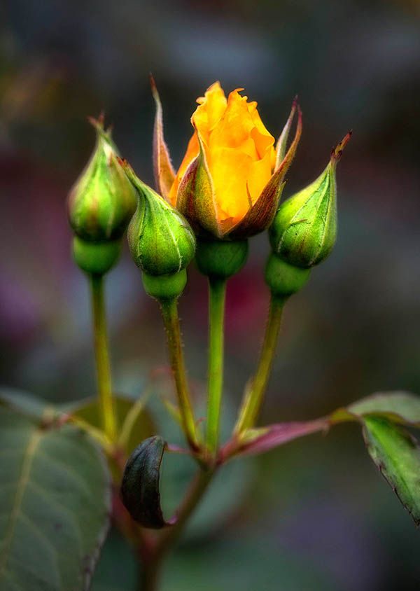
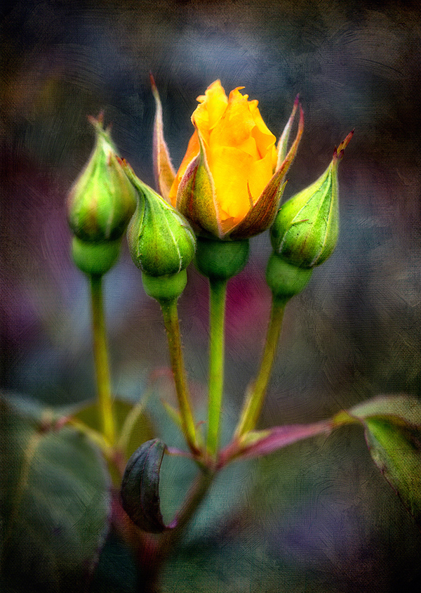
Now in the past, I might do one more step of adding a Color Adjustment Layer in black, brush maybe 70% of it away, leaving a bit more around the edges for a vignette and call it done. But my creative desire wanted me to go further. It wanted to try something different than what I always do. I’d been playing with textures lately – and asked her if that would suit her fancy. “It would”, she said. “Make it look like a painting! I love paintings,” she added. OK then… I’m here to serve. So I added a few layers that I brushed in to varying degrees.
NOTE: I have to apologize right here for not taking careful note of which textures I used and to what degrees. Truth be told, I only decided after I’d gotten further along in the process to share this whole thing with you – by then I’d merged the texture layers into one. I CAN tell you that I used a few from this particular French Kiss Collection of textures. They had a screamin’ deal awhile back and I picked up several for next to nothing. Watch for sales!
Anyhoo, that put us here:
Yeah, likin’ it!
But little Miss Creative Desire thought that while it was quite lovely… she was imagining more distinction in the colors. “NIK Software’s ProContrast filter please!”, she cried. I obeyed. Found in the Color Efex Pro 4.0 suite, ProContrast is yummy. I used a bit of both the Dynamic Contrast and Correct Contrast sliders: they each do slightly different things and play nicely together. Landing on a combo that pleased the eye AND little Miss Creative Desire… we landed here:
Alrighty! Now we’re cookin’ with gas, I thought.
“Not so fast,” Miss Creative Desire snapped. “I’m not done.”
Y’know.. I’m going to refer to her as MCD from here on out. Remember that: MCD. Miss Creative Desire.
“The textures are too rough,” she sniffed.
Rough? I queried.
“Yes. Rough. You know… scratchy.”
Ummmm, Ok. I could see that. The ProContrast filter naturally caused the textures themselves to beef up and now the textures and background color pop were competing with the flowers. Pretty – but a bit much for our taste. So I toned that down by duplicating the layer, applying some Blur, then blending that back into the rough one till it was smoother. I had to admit, I liked it better too.
It also needed some “dynamic” for my taste. What I mean is that while the flowers need to be the brightest spot in this piece, I didn’t want to brighten the flower part anymore… I wanted to offset it with deeper tones that grew deeper still toward the outer edges. But I didn’t want to use a standard vignette approach. So I found one of my grungy textures that was darkest around the edges, brought that in with the Multiply blending mode and brushed out most of it except for around the edges:
And here’s where it can get tricky. Are we done yet? It looks pretty good… when is enough? Sometimes I think the only way to know for sure is to try whatever it is that your MCD wants to see – then determine if it’s too much. In this case, here’s what I heard:
“MOODY! I want mooooooody.” She said this is a moody, sultry voice. Strange, but true.
Moody, I thought. OK. Let’s see.
I chose to go this route:
- Color Adjustment layer set to Black.
- Blending mode: Soft Light.
- Gradient Layer Tool set to Radial Gradient – pulled out and snapped at 60% or so.
Here’s what happened: (I know, it’s subtle. But we liked the slightly more depth in this version)
I decided to pull the background texture back even a bit more; again by duplicating the layer, applying Gaussian Blur (just a little!) to the layer below… then blending varying percentages back in. I mostly focused on the few textured brushstroke areas with the “sharpest edges”, as MCD referred to them.
That accomplished, I did a slight Curves adjustment in the magenta, dark purple and dark green areas. Very slight… but it made the piece light up even a bit more.
Now here’s the interesting part. This – and the next two versions ended up being 3 totally viable results. Any one of them someone’s favorite; I thought it so fun and interesting to not just have one! Miss Creative Desire thought it would be fun to make up a triplet of results to go with the triplet of roses. My, she is funny.
So, this is one, based upon what I said above:
For variation, we took a trip to the Overlay blending mode/High Pass Sharpening store in Photoshop. You do this using layers; I then blended the resulting sharpness ONLY into the buds and flower parts that were naturally pretty sharp already. I did NOT apply sharpening to any other area!…
And finally, back into NIK Software Color Efex 4.0 and the Reflector Efex filter.
Did some adjusting so the the light intensity, blending and direction all felt right and:
There you have it.
Just some thoughts about doing a little somethin’-somethin’ extra with textures added to flowers – or really any suitable subject. It’s sure fun… and also a great exercise in learning to visualize ahead of time AND listen to your creative desires/muse/impulse/genius – whatever you want to call it. If nothing else, you’ll be entertained!