Color or Monochrome?
Plan A, Hijacked
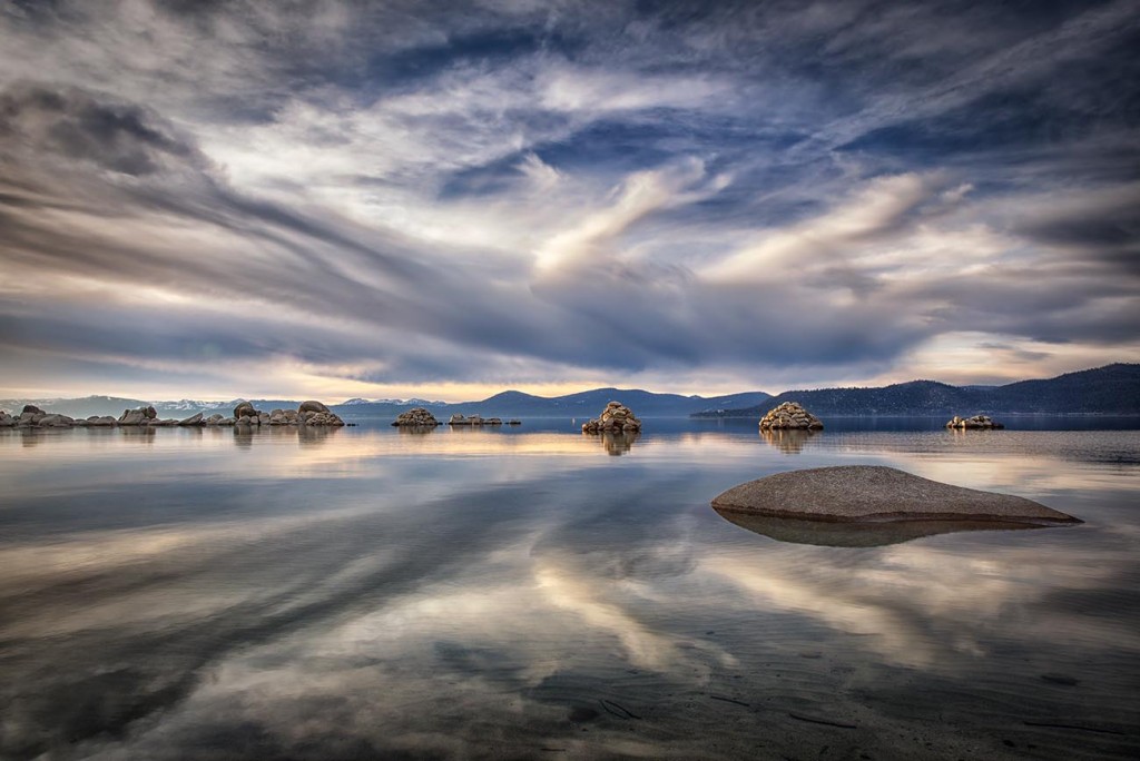
I was heading elsewhere this day; intending to shoot sunset (if there was one) at another location. But when I looked over and espied this scene, all other plans went out the proverbial window! I love matching reflections… strong cloud formations… and an almost surreal/abstract arrangement of elements when they happen naturally. It’s magic! (and this day, certainly one of my daily miracles. Especially since the west hasn’t even SEEN clouds for months!)
Color or Monochrome?
Even when I took this photo, I wasn’t sure if I’d ultimately roll with it in color – or as a monochrome (aka monotone) image. We used to always refer to monochrome as black & white. But with so many options at our fingertips these days; sepia for one, but also black and white toned with all different colors so that they appear _______ and white (fill in the blank with the color-toned black/grey of your choice)… it’s just easier to refer to say “Monochrome” or “Monotone” rather than “Black-ish & White-ish”. Heh.
All digital cameras shoot in color natively. Yes, some have settings where you can force it to shoot Monochrome (although it’ll say “black and white”. Photography is a little at odds on names in this department). But in my opinion, it’s better to let the camera shoot color the way it was designed to so you have options later. Besides, I don’t always like the choices made by the camera about it’s tones-du-mono. I’d rather make my own decisions. And what if I later decide I’d rather have color? You see the dilemma. Options rule in my world!
Picking a Likely Candidate
Certain images lend themselves more than others to monochrome. If you have one with strong lines, repeating patterns, or some kind of clean, uncluttered elements within it, you have a likely candidate. In the case of this particular photo… I had the strong pattern in the sky to begin with. It was doubled in the reflection of unusually calm water. Then, the strip of rocks dividing the line between sky and lake was clean, uncluttered and like some kind of punctuation or code. Perfect!
Ultimately, I ended up liking both. I like the muted tones of the color image above; and the fact that it looked so different from my normally rich, vibrantly colored images. I used some HDR on it; mostly in the rocks. (I did capture 5 images, autobracketed. Again, options!). For the sky/reflection, I chose to blend a couple of the middle raw photos to capture all the light and texture, then use contrast & luminance masks to bring out the natural cloud patterns a bit more. I wanted to enhance what was there, but still have it look real. I liked how the finished result of the colored version made me feel like I was standing right there on the shore.
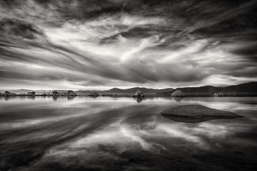
The Impact of Monochrome
But I couldn’t ignore the lure of Monochrome. I knew it would be powerful presented that way too, but for different reasons. The patterns, the strength that came through it. Those really pop when you take away the color. It creates a whole other effect, equally as valid as the color; but its own animal.
Seeing Light & Shadow Differently
I show you these, because they offer some fun things to consider should you run into an image you love with good lines, patterns and strong elements. Try converting to monochrome! Even if you don’t choose to go with that version in the end, converting color images to black and white can train your eye compose better, because it breaks a photo down into basic light and shadow. Which, in the end, is all we’re working with anyway!
Once you start seeing your color images with Monochrome eyes, it’ll help you start honing in on what to include/not include in your frame.. and what tells your story best. A bit of technique can help artistry ALOT!