The Color of a Mood
I Love Color!
It’s no secret that I love color! I know a lot of people feel the same way I do.
As I was processing today’s photo, I was thinking about how color is such an intricate part of our lives that we even use them to describe feelings. What’s more, everyone knows exactly what you’re talking about even if they’re color blind!
Color As Emotion
The speaking of a color is so powerful, in fact, that you only need few words to be crystal clear:
I was in a blue mood… (sadness, melancholy)
Alt: I feel blue… (sad, off, melancholy)
He was so mad he saw red… (extreme anger)
Everything’s golden… (everything’s terrific)
She was green with envy… (extreme envy, jealousness)
She looked at everything through rose-colored glasses. (she only saw the good in things.)
So when you process a photo and use color grading, cross-processing or color in some way to set the mood you want viewers to feel when they look at your photo – you’re tapping into a powerful, primal mechanism!
Set Your Viewers’ – Or Just Your Own Mood with Color
You can also use color to satisfy your own mood, or the vision you have for a piece.
I did a fairly extreme “processing two ways” combo the other day, which I thought was an interesting way to show you what I mean. Truly, the possibilities are endless!
Here’s where I ended up on the first round of processing:
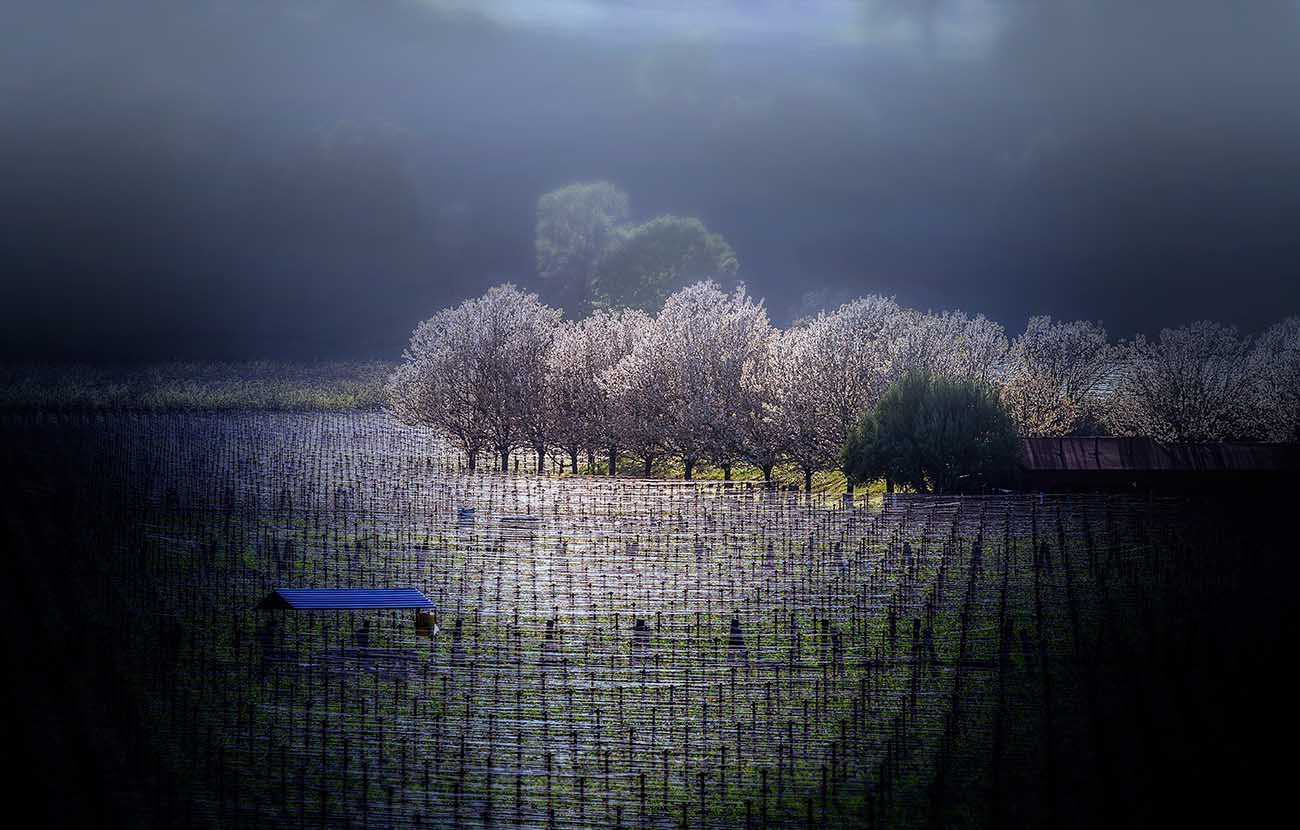
Version 1 – Kind of Dreamy
This was a single exposure that I’d put through its post-processing paces using adjustments in Photoshop CC, the NIK Collection, OnOne Software and probably bits from a couple others. I experiment a lot when I’m processing just for myself and don’t always keep track. So many hits and misses! But above is where I ended up.
I liked it! I had liked the composition when I shot it – and the light in particular. I wanted it to feel real, but a bit dreamy – and I could see the finished product in my mind’s eye when I shot it.
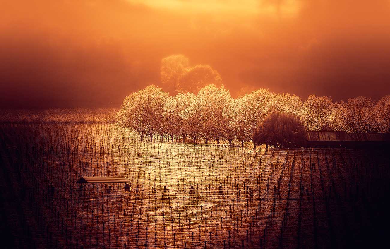
Version 2 – Hot, Otherwordly, Even Dreamier
As I looked at it – I thought “That’s cool. It’s just fine.”
But then I wanted more; something different than my norm. I was feeling experiment-y. And I wanted this scene to feel as if it were from this realm, but not of it. Oh, and hot. I wanted Italy summer afternoon hot… with a thick, lit-from-above atmosphere. I had already used blur effects and brushing in the mist in Photoshop… now to find the color grading combo that would boot it to the next level.
I tried a couple of color efex both in NIK and in Photoshop and finally landed upon orange as a PS overlay. It just felt right, if a bit much all by itself. So I brushed just a little away from the center – then then I anchored it with a dark indigo adjustment layer set to the Lighten blending mode, so that the color only appeared noticeably in the shadows. It actually slightly toned the entire photo – but you don’t see it as much as feel it. Yellow – and even orange is complementary to blue, so it made it feel just right.
That was the mood I was in that day… and this is the color it turned out.
It’s All About Keeping Fresh Eyes
I mention all of this because I think it’s a grand idea to try stuff in processing you’d normally never do once in awhile. If for no other reason than to freshen your eyes – and try to see differently. It’s yet another way to keep from getting stuck in your ways and have a new experience!