Photo Processing, Macphun and Imagination
Photo Processing Questions
I get asked a lot about my photo processing. About whether I have tutorials on how I do it. About whether I offer presets for any of it. I thought I’d aim today’s chat towards a bit of that.
And BTW… I like saying “chat” or “conversation” more than “post”. Truly, I see you all in my mind’s eye when I write – and I honestly never think that I’m posting to you. What does that mean, anyway? I’m talking to you. And I love it when you talk to me too.
OK. Had to get that off my chest.
Back to the question at hand. Typically, I’ve found it difficult to do tutorials on what I do, at least in the overall, since I approach each photo like an original creation and don’t batch-do ANYTHING. I let each image talk to me (sometimes I talk to it too. Don’t judge me!) and then I try to tell our story. How do you teach that?
THAT SAID… what I’m going to share with you today IS something I can wrap my head around well enough to share with you – and perhaps make a difference in the expression of your special view of the world. It involves Macphun Software and their special suite of plugins.
Oh yeah, fair disclosure: I use both Photoshop tools and a variety of plugins in my processing. Some people think you’re cheating or something if you use plugins and aren’t some kind of elite Photoshop master wizard. I beg to differ! Plugins for me have always tickled my imagination into new directions, enticing me into see, think and feel in new ways that I wouldn’t have otherwise. (You know how I love that!) So I’m a fan of using them AND using Photoshop tools all in the same brew… and could use an entire post for each one. But today, I’m focusing on Macphun. I processed this one in Tonality Pro:
Some of you know that I partner with Macphun. I spoke at their West Coast press conference when they launched Tonality Pro – one of my favorite plugins of all time. And I share how I’m using their products from time to time, as my own grasp of them deepens and I discover new things, because I really do think they’re quite wonderful and unique. Hence, today’s share/chat/conversation.
OF NOTE: Right now, Macphun only supports Mac. So if you’re on Windows, today’s conversation might make you sad… but please don’t let it! I encourage you to use this as a chance to gather some cool ideas, take them back to the tools you DO have and try to produce something similar. Something you might not have thought of before. That’s how you expand your world of processing possibilities.
OK, I’ve blabbed enough, I’ll try and let images do some talking now…
Tonality Pro & Intensify Pro: 1 Photo, 2 Ways
Tonality Pro and Intensify Pro are the two apps I use the most. Both allow you to work in layers for control to the max. You can be as subtle or as bold as you like with either of them… but let’s start gently. Artistically. Classically. I typically use Intensify as just ONE of the steps in my processing, unless it’s a very simple image like this one. Tonality Pro is usually the one-stop shop for me.
But I wanted to show you how Intensify pulls out just the elements you need to give an image detail, depth, pop… without being crazy. (Unless you want Crazy!)
Here’s an image I took up on Donner Summit in the Sierra Nevada Mountains of California. It’s a dead Lodgepole Pine. Lodgepole is much-beloved here, because they signify all that we see ourselves to be as mountain people: tough, strong, individual, able to stand up to the elements here. Winter after brutal winter up there on the summit, lodgepoles bend, adapt, form beautiful lines and patterns that display the life they’ve been through – but they never break (well, never say never… but you get the poetic drift). They give when all life is gone too: Lodgepole in incredible firewood.
To me, this image contained ALL of that. I didn’t want to mess with the vibe… but I thought of two simple ways to show it off. First, here’s the original:
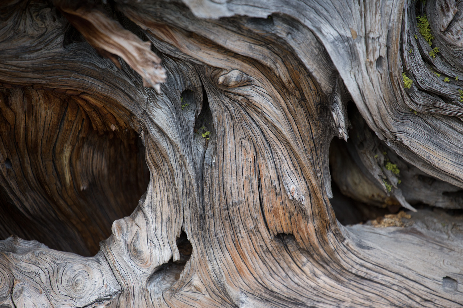
Out of the camera, the RAW images are always a little soft and flat. But if you saw this in real life at 8000 ft, you’d think it was anything but! I wanted to “brave it up” just a little so it came close to how I experienced this warrior; where it had grown, lived and died in a mere crack of a ginormous granite slab. For this, I used Intensify Pro. It does an incredible job of details, structure and subtle color. I went with my favorite preset for this purpose: “Elegant Softness”:
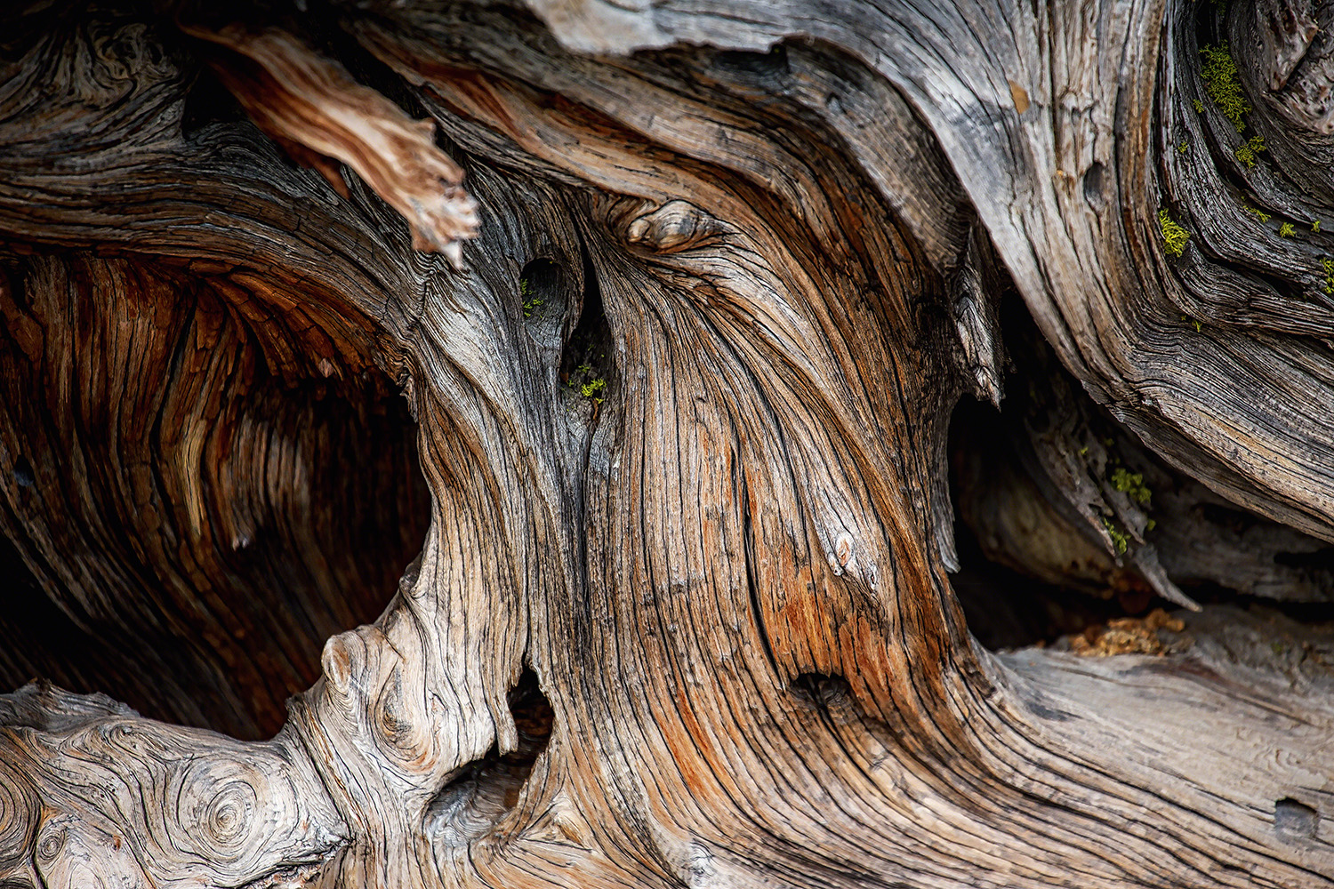
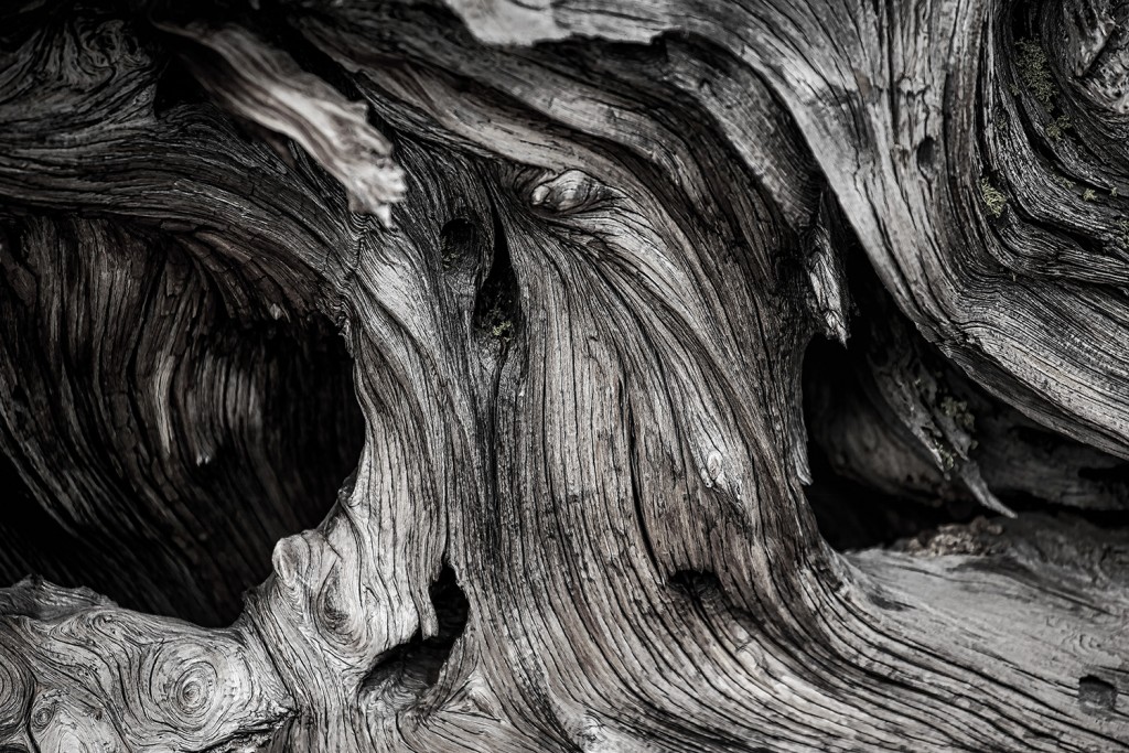
In a gorgeous frame, in a mountain home of similar hues… this would be stunning. Simple, elegant… bespeaking of the area and its virtues. Idea #2 is black and white, but with a twist.
Enter Tonality Pro, which does monochrome like nobody’s business – but with the added feature of also controlling color channels to an almost infinite number of self-chosen effects. I chose this subtle combo of black, white – then bringing back a wee bit of red and yellow in the Color Filters section: (When you click on this one, it’ll take you to my portfolio page, as will a couple of others in these samples… they look better and you can see them bigger that way!)
Tonality Pro – Sky’s The Limit
More on Intensify in a minute, used as part of a workflow. But first, a bit about my love affair with Tonality Pro. I started photography in black and white over three decades ago. Cut to now. I’ll be honest and say I still love NIK’s Silver Efex… but the color channels and some of the other goodies that Tonality gives me has made me a fangirl. It’s become my “go-to” app for all things monochrome… and sometimes, even color! Here’s the original image of an old outhouse in an aspen grove, not far from where I live in Truckee, California. It’s a classic shot – all the local photographers do this one.
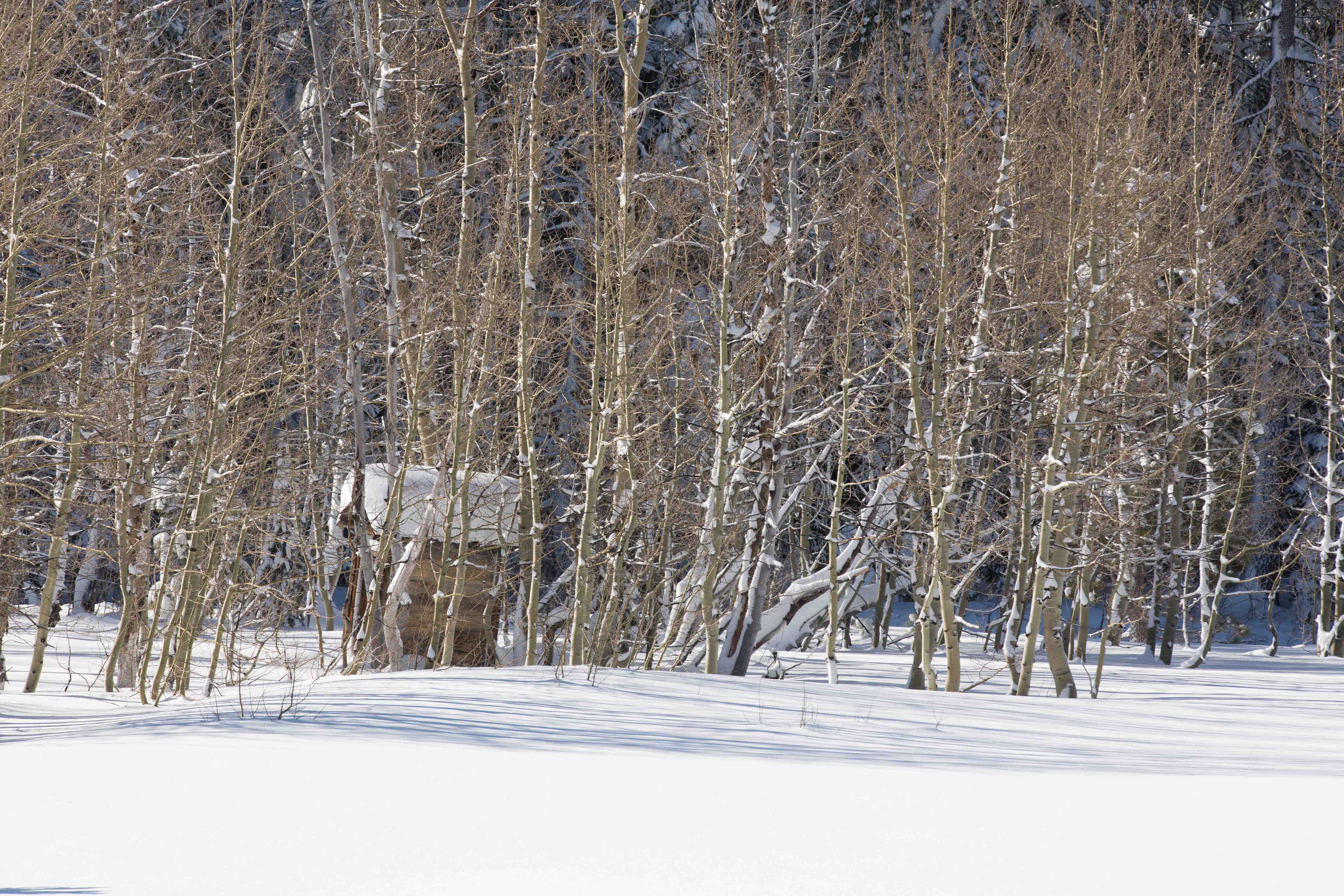
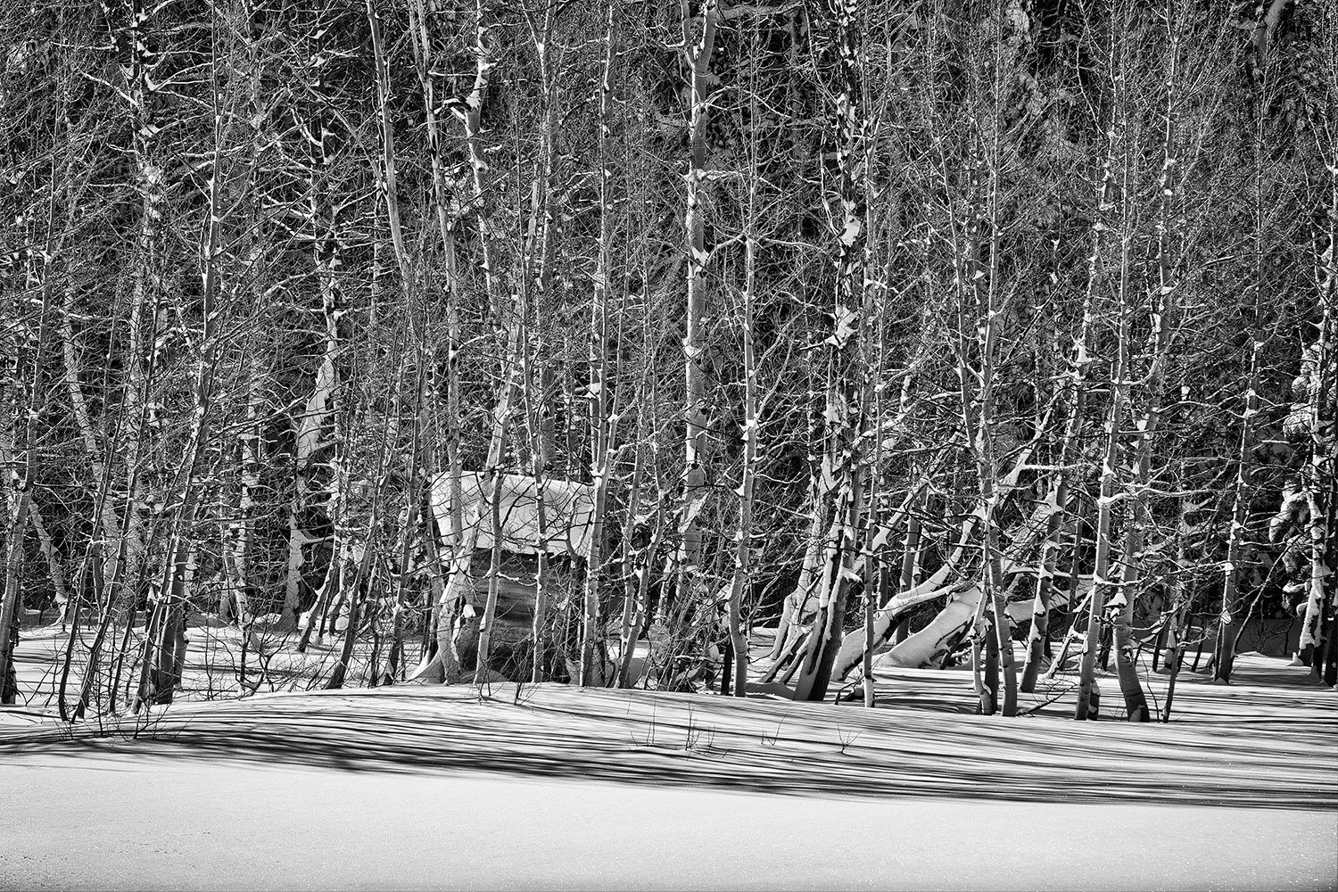
In Tonality Pro, in addition to working in layers, you can also there’s selective color, found in the Color Filters option. In the original, the thing I liked most were the blue tones… I savored the yellow tones least. So I wondered how it would look if the only color I brought back was blue. This takes, like, 3 seconds to do – so why not? I added a bit of Glow option within Tonality Pro for atmosphere:

Where I DO Use Presets – And Make My Own
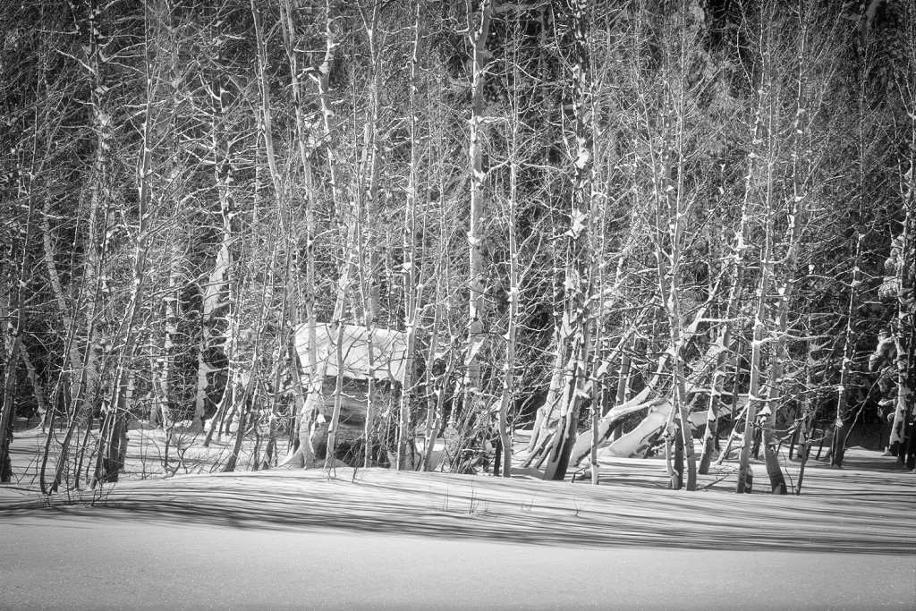
Now, the one place I DO offer presets is in the Macphun Marketplace … for Tonality Pro. I made them for myself to quick-start the toning and detailing of my own personal images. You can make your own too, if you have a “look” that you tend to favor. It’s the only time I ever use presets, interestingly. This one’s called Seldom Seen, which I created from the tones I always loved in the darkroom – plus the incredible detail we can call up with today’s detail and structure tools. For this example, I used Seldom Seen by itself:
Then, in just a few seconds, I added a bit of Glow and Luminosity for atmosphere. I don’t necessarily like my b&w images to be too “clean”. Their roots are from an analog era… I like to honor that, even if I add modern twists. BTW: Luminosity is found within the Vignette filter. Conveniently, you don’t have to actually add a Vignette in order to use the Luminosity filter!
They’re all viable choices, I’m just giving you some examples of how I’ll typically play with Tonality Pro for different vibes. Even if you’re on a Windows machine, these can still give you some fun ideas and inspiration to try out using your own tools. That’s how I learned a lot about processing. Heck, I still do that!
Intensify Pro As Part of Workflow
Finally, here’s an example of what I mean about using Intensify Pro as part of my own workflow. In a typical, more involved “KHutt style” of processing, I want rich, defined details – but don’t want to add artifacts or noise along the way. It’s especially important as I add layers and effects like layers of paint… if the image doesn’t have strong “bones”, it’ll turn to mush by the end. So, I began with this Original image, from Lucca, Italy.
I used this for the front of the building… to be Intensified!
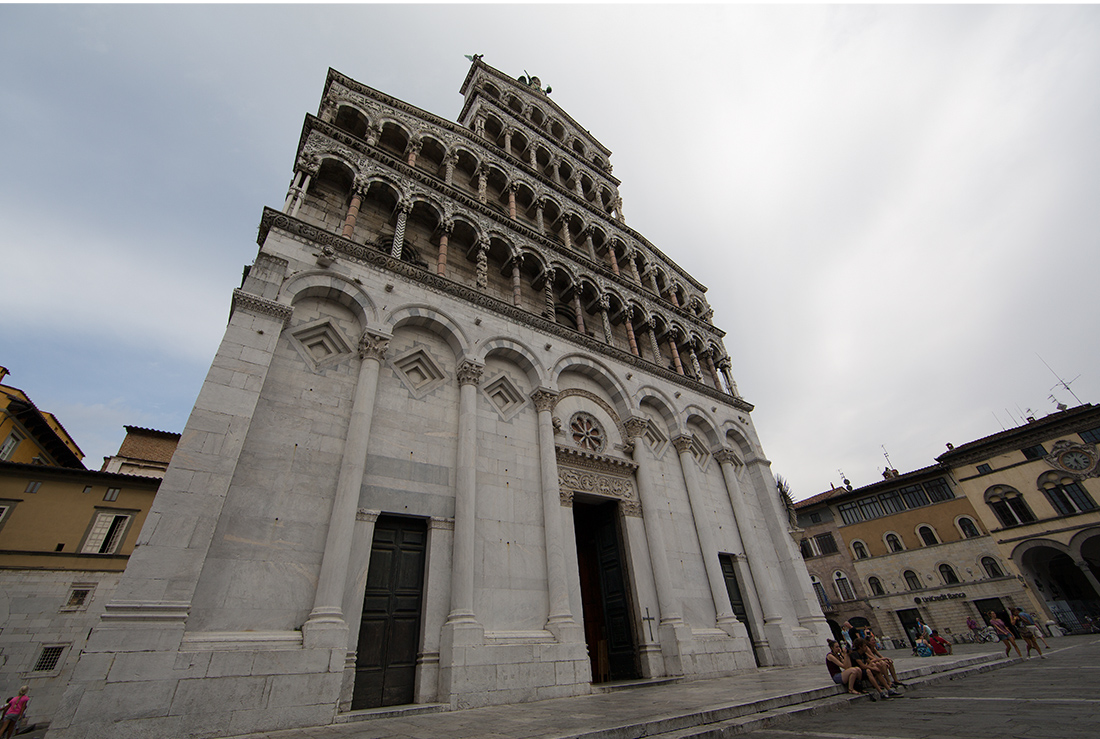
But I shot the scene auto-bracketed, for possible HDR processing. I used Photomatix to get my basic HDR image… and did it primarily to get the full spectrum of the sky. Even that will be adjusted along the way…
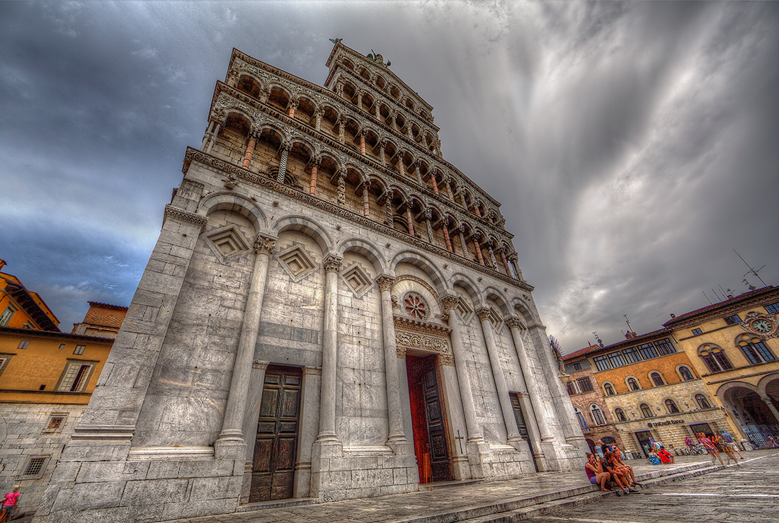
The next image shows the combination of the two. The steps I used to get there:
- Applied Intensify Pro to my Original image. I used the Elegant Softness preset, then made some slight Details adjustments in a separate layer within the app.
- Used Photomatix to create the basic, rough HDR image from which I’ll pull the sky.
- Took both images into Photoshop CC 2014 as layers, then brought the sky from the HDR image into my Original image.
- Cleaned up the noise in the sky that HDR processing creates, eliminated some people distractions in the lower left corner, balanced out colors and tones.
For many, this would be done – and it would be a fine image. For my brand of processing though, this is the “base image”:
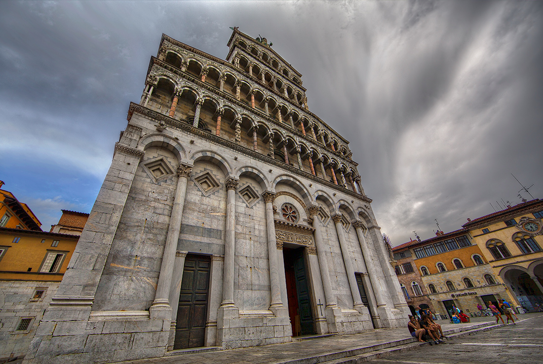
Going “KHutt”
Naturally, I have to carry it all a bit further. I mean, I purposely used a lens (Canon 14mm prime) that would make this building lean, the lines in the sky and angles of the buildings feel swervy, leading your eye all over the place (in a good way). So, I don’t want to process it in a totally serious, straightforward manner. For me, that would be like stopping 10 yards before the finish line!
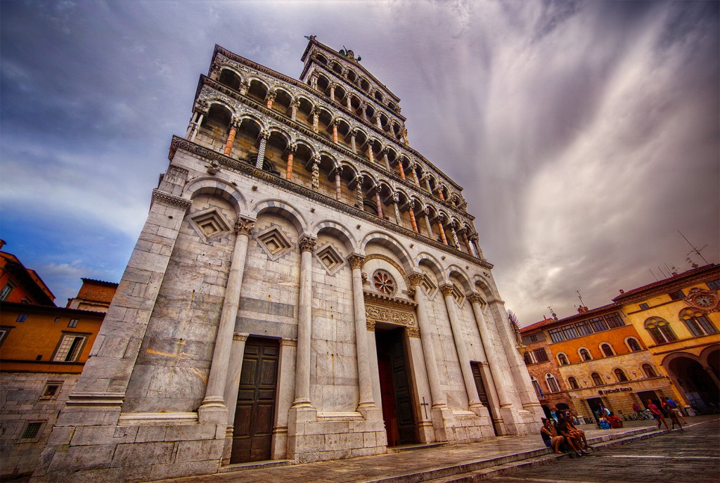
So, I pulled out one of the new textures I’m creating for Macphun (a coming release for early spring… but I’m testing them like crazy right now!)… applied that and did some playing around in Alien Skin 7, NIK’s Color Efex Pro, OnOne Software’s Perfect Effects 8, Photoshop tools – and finally ended up with the image below. And who knows… on another day, I might take a whole different route on this last KHutt-inizing step. That’s the part that isn’t so nail-downable. It’s capricious – and I like it that way.
However, the the “basic” part – of using Intensify Pro as I did – then combining the two images to arrive at what I call my “base image” would still stay the same.
So these are just some samples ‘n examples of how I use these two SUPER handy and awesome tools… Intensify Pro and Tonality Pro. Seriously, the possibilities seem endless to me! And hey, if you think one of the Macphun products would work for you… then check them all out by using this link and the discount code KHUTT. You’ll get 10% off your purchase… and yes, I’ll receive a few cents too. Full disclosure on that! But know that I ONLY partner up with companies who make things I absolutely love and use. Such is the case here!