Speaking Of New Stuff in 2015…
More New Stuff!
When last we spoke, I sneak peeked VIDA. Still super stoked about that; should have more to report soon! But wait, there’s more…
I’ve got a few more projects brewing in various stages… but one of them IS ready to share with y’all. (I love telling you guys first!) This one’s just fun. Y’know, surprising. Delightful. It’s something I’ve been developing and using on my own photos. And I’m creating them with the awesome Tanya Wallis.
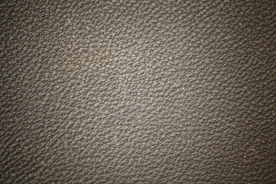
This “something” is in the textures/hues/overlays arena. Oh I know what you’re saying; jeez, there are TONS of those out there! Believe me, I know. Between Tanya and me, we’ve used quite a few of them. They’ve been cool, but more and more I’ve been craving something “extra” out of them. None were truly delivering the magic sauce just the way I wanted them to. It’s so subjective, I know. The thing was, I couldn’t quite put my finger on it, yet I could see what I was after in my mind’s eye; which is like having an itch you can’t quite scratch. Maddening! So I decided to see if I could create my own. Enter Textures, Round One.
I asked Tanya her opinion on my first pass. She basically suggested (so kindly, yet in her typical pull-no-punches Aussie sort of way) that I take them further. Y’know, go more KHutt-style with ’em. Long story short, it was like being given the keys to the candy store! I went to town and painted it…well, a lot more colors than red! And y’know what? They started turning out some unexpected and pretty cool results.
Will They Be a Hit? Who Knows, But I Love Them!
Will these sufficiently different to make a splash in the market? Heck, I don’t know… I just know I’m starting to use them more and more myself and loving the results. I CAN tell you they do something for my own photos that nothing else does. Mind you, we’re still developing them for prime time – and they’re almost there! We think they aren’t just another boring texture, but rather an awesome tool to transform and inspire images – to take them to a new level in really unique ways.
They’ve got a natural vignette and are coloured in different hues to bring that little somethin’-somethin’ to an existing image, typically applied in either Overlay or Soft Light blending modes in Photoshop. Although I have to admit, I applied one today in Macphun’s Tonality Pro and giggled out loud at the McNeato burrito result! Our tests have been both on finished images – to see if they add anything extra or cool – and on some of our ‘so-so’ images. Both have shown some really sweet results!
My Personal Acid Test: Landscapes
I wanted to jump right into testing on landscape photos. If they couldn’t pass this litmus test, they were useless to me. Personally, I find landscapes to be the hardest to apply textures to without creating a big fat mess. But I wanted to try, because y’know, sometimes even though I have a perfectly good finished product – and think the processing is fine and all – I’m still left wanting a little somethin’ extra. Yet at the same time, I don’t want it to slide off the charts into crazyland. I just want it to sing a little more, y’know?
So for starters, I purposely chose an image I already liked. Didn’t want more color or contrast – it had plenty. I really was just curious to know if one of these new textures could add anything useful to the conversation. I kind of dared it to, if you want to know the truth!
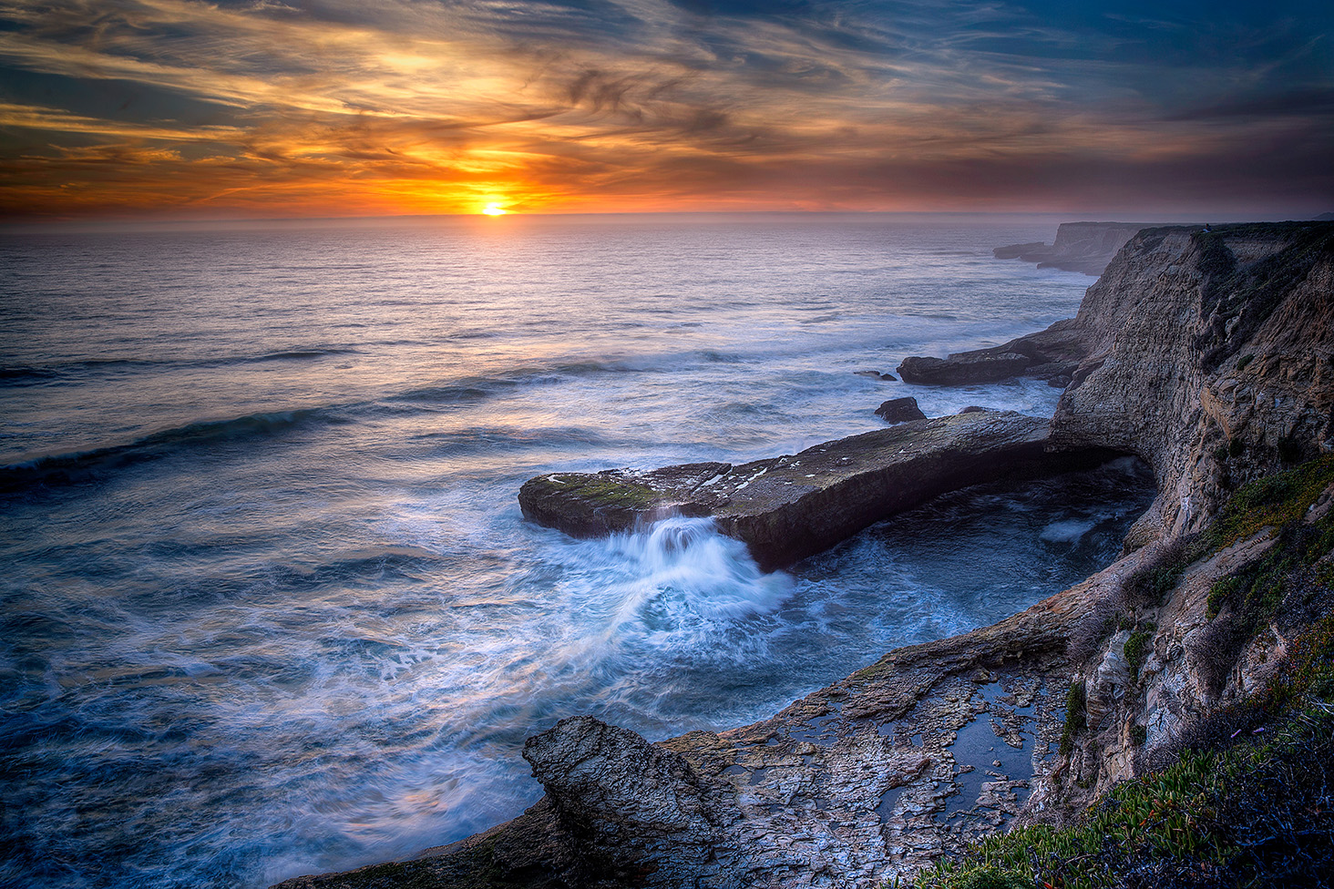
Here’s the Before: I really had no complaints about it. A nice sunset oceanscape just north of Santa Cruz, California.
Enter the Time Traveler…
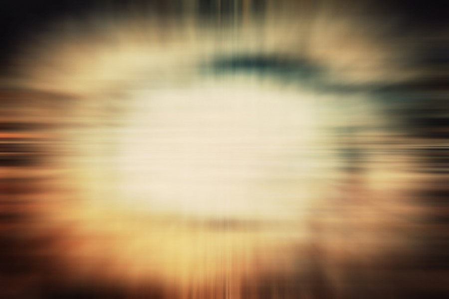
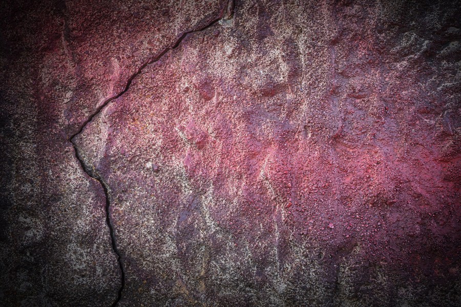
I kind of chortled like The Joker when I pulled this one out… it’s crazypants! Part textures, part hue… I created from a photograph of a rock, using blurs, other textures and color gradients. I named it “Time Traveler”:
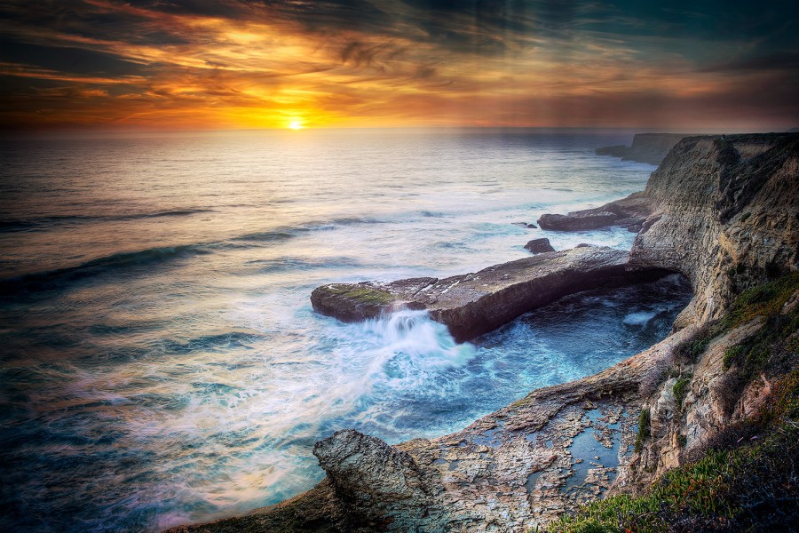
Applied with a Soft Light blending mode in Photoshop… and this is what happened:
I giggled out loud. I liked how it didn’t turn it into a completely different photo. It added it’s own “thing”… but did so fairly subtly. Definitely cool. And like I say, the result surprised me as a basic application.
Another Dare-To-Self…
Then I wanted to challenge a texture to do something unique to a photo that seemed impossible. One that had NO need for one at all… that absolutely didn’t say “Apply a texture, please.”
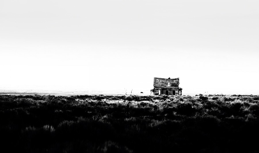
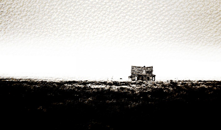
So I chose this one. I mean, what the heck can you do with IT? Especially since it was meant to be all minimal and stark:
So I threw this at it, having no idea what it would do: (I used the Vivid Light blending mode, which is something I rarely use either. I mean, go big or go home, right?)
And this is what happened. Again, different, interesting… and surprising. I do love being surprised (only if it’s good, of course). Whether it’s your own preference or not – well, that’s a personal choice. The point to me was… it presented a viable option. Cool. The two hardest tests down… what else could they do?
Could a Peculiar Flower Have New Life as a Fresco?
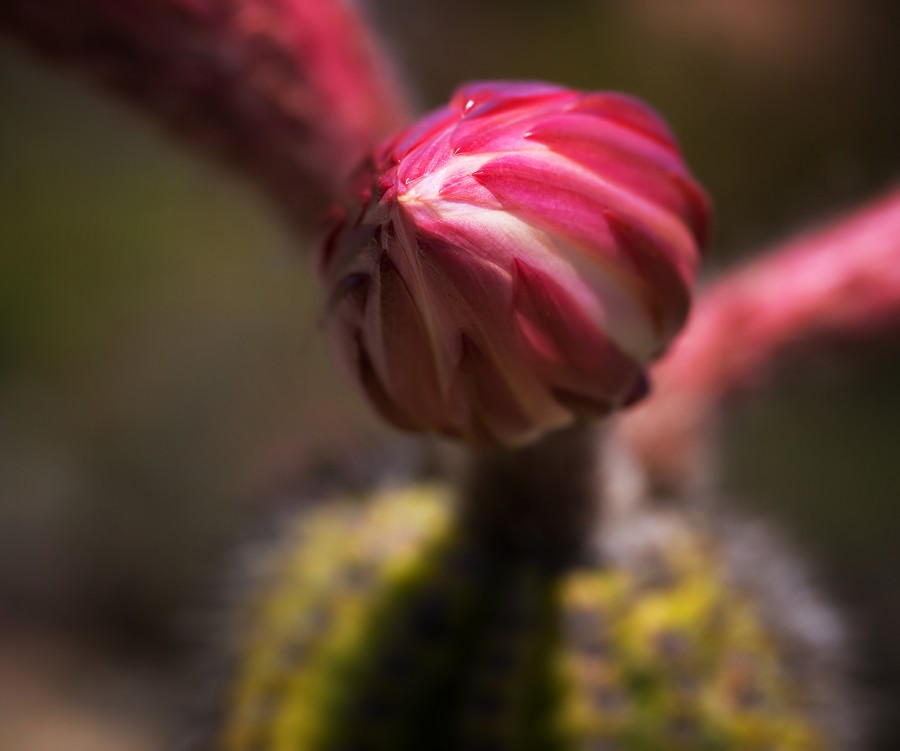
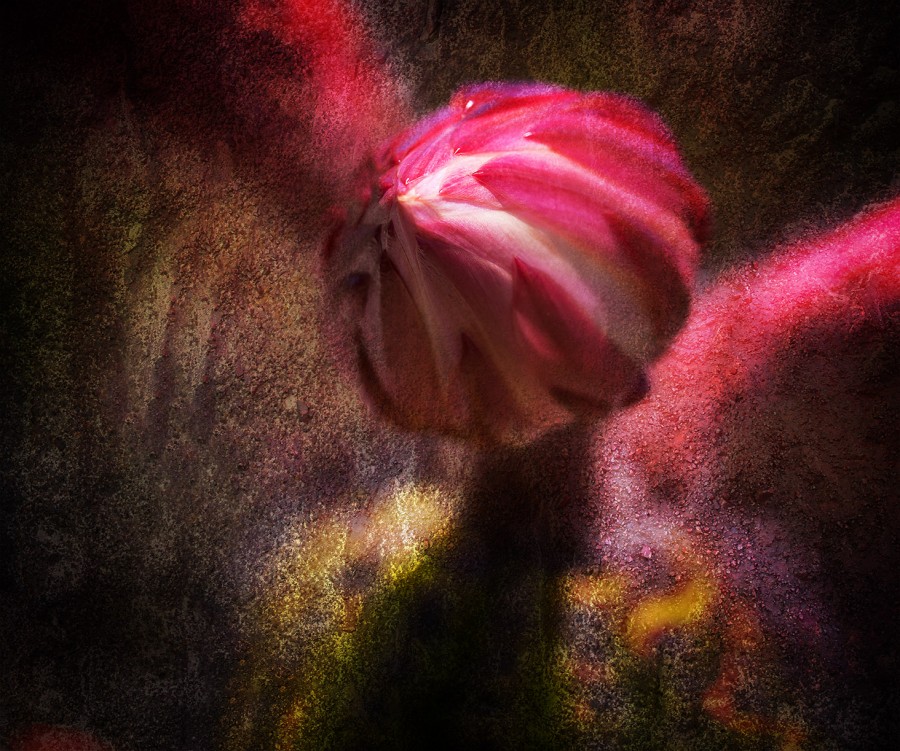
I always wanted to like this image more than I did. What a weird flower… a cactus, I believe. It appealed to me and weirded me out in equal measure. But I could never quite delete it, nor get quite resolved with it either.
This texture concerned me. A bit strong… and what about that crack? Well, the only way to know was to give it a shot.
Here it is, applied in Soft Light blending mode… with the bit around the flower itself brushed out a bit. It changed everything! The light looked different… it looked like it had been painted on plaster or stone… and it finally made me smile!
But What About Multiples?
So this went on and on till we had quite a collection. Then I started to wonder how they’d work in multiples; more than one in an image. I’ll show you one I did today as an experiment.
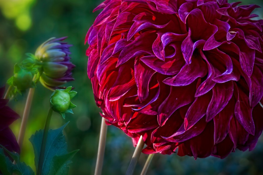
This was from a few years ago… a red dahlia from the Butchart Gardens in Victoria, B.C. I processed it to be fanciful, didn’t mind the result at all. But what might be a new direction?
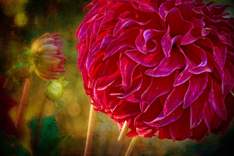
I went with all four of these hues and textures, applied, stretched, brushed out here and there….
And wound up here. A new approach on an older photo.
My biggest test has been whether these are viable or not… and whether they make me want to start reaching for them for my more creatively processed pieces.
The answer seems to be: Yup… and yup!!
Like I say… it’s all a works in progress right now, emphasis on the progress. More sooooooon! 😀
