The Textures of Paris
Paris in the Springtime
I’ll keep today’s missive short(er)… since lately I’ve just been blabbing like a babbling brook, haven’t I? Heh.
So… put on some lovely French jazz, heat up a croissant and pour yourself a cuppa cappuccino… we’re going to Paris today!
We’ll talk about these two images in a sec… but first, I AM going to Paris in May! In fact, you could join me if you’re in the mood for an awesome street photography workshop. No, I’m not teaching it… but I’m tagging along, doing video, Virtual Photo Walks, etc!
Valerie Jardin is a good friend of mine, who gives the most incredible street photography workshops in amazing places… Paris, Rome, NYC, etc. She’s also French and knows Paris like the natives. Maybe better, since she sees it through the lens of a camera. TOTALLY different view!
Anyhoo, her May workshop was completely booked up – but suddenly just had 2 spaces open up. They’ll be snapped up in no time flat, I’m sure.
So I thought (I’m a thinker, I am!) HOW FUN it would be if a couple of folks from the KHutt camp came along! Street photography… Paris… May?? SIGN ME UP!
Oh wait. I already did. Grin.
And now – you can too, if you wanna join us for an amazeballs week in Paris at the end of May!
Before/After and Why It Matters
They were taken in Paris, naturellement. This was from one snowy December night in 2010. That was the trip I vowed I would one day visit Paris again – in May!
But I’m bringing textures into the conversation – since R&D is still going on with the new ones Tanya Wallis and I are developing. So I took this photo of a corner in the Bastille neighborhood of Paris… which I liked a great deal…
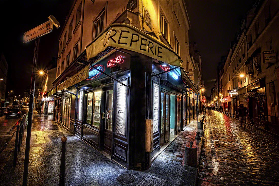
I wondered what one of our more subtle entries on our “short list” contest (we’re now determining which ones will definitely be in the first rollout) would do to an already nice photo. This one’s called “Soft Chill”. Would it add anything? Detract? What could I learn by doing this? I specifically wondered if the white in the middle of the texture image would enhance… or wash out the light of the creperie. Because, you see… it’s not just about adding texture to an image… it’s about subtlety shifting the light within one too. The power of textures, hues and light is way more complex than a lot of people think!
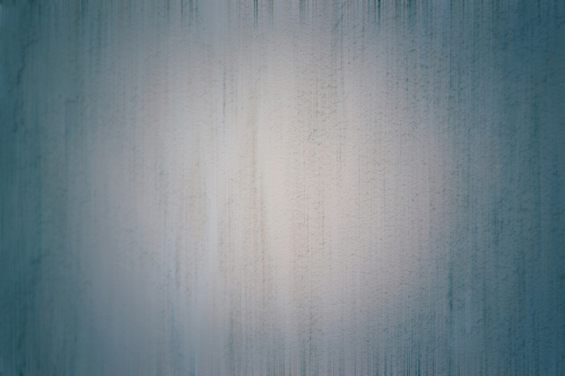
I was surprised and delighted to see that what happened here was both subtle – and light-oriented! In photo processing, directing light in subtle ways is such an art unto itself. It can take an OK image and make it a WOW one, without anyone (except you) quite knowing why. Getting the light just right can make or break your results. It’s something I pay ALOT of attention to, all by itself as a separate step in my processing.
Subtle is Coooool
This texture on this image made the light from the shop sparkle just a bit more, for sure. And the cool, blue cast of the fluorescent lighting took on the tones from the texture just enough to make them light up and spill out onto the street without blowing them out out. Blue is, of course, a complementary to gold and orange-ish tones, so color wise that worked out well for the rest of the photo too.
The slight vignette just so slightly darkened a few the potentially distracting elements around the edges… without eliminating them altogether. This allows the eye to still travel around the image, but then land on the central focus of it.
The patterns within the texture itself disappear amidst the textures of the photo… and that’s just fine with me. What I wanted THIS texture to do was redirect light, not add more busy-ness to the image. And it did that wonderfully! It’s all so interesting to me!
Website Launch: I Can See It!
The big news is that the product itself is almost ready. (wheeee!!)
My new website should launch in the next week if all goes well; we’ll add the storefront within the next month after that.
Stay tuned! And just maybe… vous voir à Paris (see you in Paris)!